GPT Image 2AI 提示词
Japanese Brand Strategy Infographic — Sora 2 Prompt
Creates a minimalist, professional infographic with a 16:9 layout, icon-driven cards, and a cohesive cyan-navy color scheme for clear brand strategy education.
提示词 · EN
type
日本品牌信息图style
visual
简洁的企业扁平化设计,与网站品牌风格一致的说明性图形,青色与深海军蓝配色,柔和的灰白色背景,细薄的薄荷绿轮廓,圆角卡片,极简矢量图标,宽敞的间距,编辑排版mood
专业、值得信赖、具有教育意义、易于理解canvas
aspect_ratio
16:9background
浅暖灰色header
badge
text
总结shape
圆角六边形徽章color
青色title
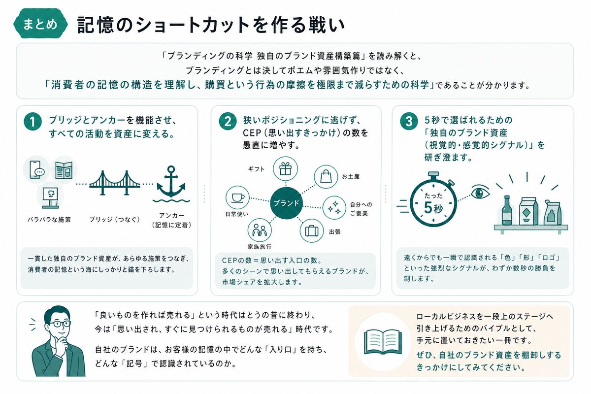
打造记忆捷径的博弈intro
position
标题下方shape
大圆角矩形text
研读《品牌营销的科学:构建独特的品牌资产篇》后可以发现,品牌营销绝非空谈或营造氛围,而是‘理解消费者记忆结构,并将购买行为的摩擦力降至最低的科学’。emphasis
以青色显示引文并加粗layout
sections
item 1
title
1position
左中count
3labels
item 1
零散的策略item 2
桥梁(连接)item 3
锚点(固定记忆)heading
通过桥梁与锚点发挥作用,将所有活动转化为资产。graphics
icon_count
5icons
item 1
带有卡片的对话气泡item 2
宣传册或折页item 3
展示架或招牌item 4
吊桥item 5
带有波浪的锚connector
连接序列指向桥梁和锚点的虚线footer
一致且独特的品牌资产,能连接各项策略,并在消费者记忆的海洋中稳稳地抛下锚点。item 2
title
2position
中中count
5labels
item 1
礼品item 2
伴手礼item 3
犒劳自己item 4
出差item 5
家庭旅行heading
不逃避狭窄的定位,而是脚踏实地增加 CEP(记忆触发点)的数量。graphics
center
标注为“品牌”的青色填充圆圈outer_icon_count
5outer_icons
item 1
礼品盒item 2
购物袋item 3
圆圈中的闪光item 4
公文包item 5
人群extra_icon
左侧作为日常使用提示的咖啡杯connector
从中心品牌圆圈指向每个周边提示的虚线footer
CEP 的数量 = 被想起的入口数量。能在更多场景中被想起的品牌,才能扩大市场份额。item 3
title
3position
右中count
3labels
item 1
5 秒item 2
独特的品牌资产(视觉与感官信号)item 3
颜色、形状、Logoheading
磨炼“独特的品牌资产(视觉与感官信号)”,以在 5 秒内被选中。graphics
icon_count
4icons
item 1
带有大字“仅需 5 秒”的秒表item 2
眼睛符号item 3
货架上的瓶子item 4
货架上的两个纸盒或包装产品accent
秒表和眼睛周围的短动效线条footer
即便从远处也能瞬间识别的“颜色”、“形状”、“Logo”等强烈信号,是决定几秒钟内胜负的关键。bottom_band
count
2left_block
graphics
腰部以上的商务人士插图,西装革履,手托下巴,简约扁平矢量风格text
“只要产品好就能卖出去”的时代早已结束,现在是“被想起、能被迅速发现的产品才能卖出去”的时代。您的品牌在客户记忆中拥有什么样的“入口”,又是通过什么样的“符号”被识别的呢?right_block
graphics
包含打开书本图标的圆形徽章text
作为将本地业务提升至更高阶段的圣经,这是一本值得放在手边的书。请务必将其作为盘点自身品牌资产的契机。typography
language
日语title_weight
粗体重型无衬线字体body_weight
简洁无衬线字体number_badges
青色圆圈内的白色数字composition
grid
中间行均匀分布三个圆角卡片,上方为全宽介绍面板,下方为全宽总结面板alignment
平衡、居中、空间感强shadow
极细微或无阴影关于这个提示词
Creates a minimalist, professional infographic with a 16:9 layout, icon-driven cards, and a cohesive cyan-navy color scheme for clear brand strategy education. 它更适合作为 GPT Image 2 的概念艺术起点:先保留画面结构、主体关系和风格约束,再替换成你的品牌、人物或场景。
这条提示词使用结构化 JSON 组织信息,包含 type、style、canvas、header、intro、layout、typography 等字段。保留这种层级能让模型更清楚地区分画面主题、布局、界面元素和细节约束。
使用时建议先小幅修改主体、场景、镜头和色调,再生成多个版本对比构图与细节。这样页面内容对用户有实际帮助,也避免把模型名或标签机械堆在正文里。
如何使用这个提示词
- Copy this entire prompt structure and paste it into your chosen AI model (e.g., Sora 2).
- Ensure the model supports complex JSON-like structured prompts for detailed graphic generation.
- Review the generated output; you can tweak elements like the color palette (
青色,深海军蓝), aspect ratio, or specific icon labels to better fit your brand or topic. - Generate the image. For best results, use a model known for its strong understanding of design layouts and vector-style graphics.