GPT Image 2Prompt IA
Fictional Academic Chart: Oil vs Shark Attacks — Sora 2 Prompt
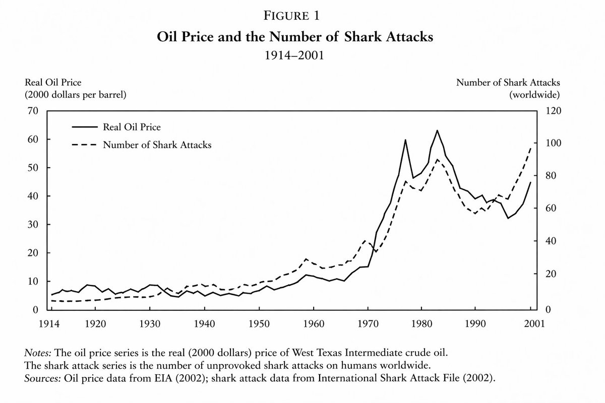
Generate a highly realistic yet fictional economics line chart showing the imperfect correlation between oil prices and shark attacks, perfect for mock data and presentations.
PROMPT · EN
来自一份重要且权威的 argfield: 经济学论文 的折线图,展示了 argtime period: 1914 年至 2001 年间 argvariable one: 油价 与 argvariable two: 鲨鱼袭击次数 之间存在紧密但不完全一致的关系
À propos de ce prompt
Generate a highly realistic yet fictional economics line chart showing the imperfect correlation between oil prices and shark attacks, perfect for mock data and presentations. Use it as a Art Conceptuel starting point for GPT Image 2: keep the visual structure and style constraints intact, then swap in your own subject, brand, or scene.
Start by replacing field, time period, variable one, and variable two, then keep the camera, composition, and material cues in the same order. This makes the output easier to compare across variations.
Comment utiliser ce prompt
- Copy the prompt from this page.
- Paste it into your preferred AI image generator (e.g., DALL·E, Midjourney, Stable Diffusion).
- Customize the variables (field, time period, variable one, variable two) to fit your desired scenario.
- Generate the image and download your fictional academic chart.